pick a piper: all her colours.

Long story short: I’ve been waiting three years for Pick A Piper to release a full length album. And my dreams are coming true.

Pick A Piper - All Her Colours cover

I first wrote about Pick A Piper three years ago, and since then they’ve maintained a justifiable position of glory in my regular iTunes rotation. Created by Caribou’s Brad Weber, he oversees the highly collaborative outputs of Pick A Piper with friends like Angus Fraser, Dan Roberts and Ruby Suns’ Ryan McPhun. The first glimpse into the new record came two months ago with the release of Weber and McPhun’s track “Lucid in Fjords.”


Then the gifts kept coming, and three weeks ago they announced their first full-length LP “All Her Colours.” I mean, c’mon: the album has “colours” in the title. It’s like they’re doing this just for me! Though I fell in love with Pick A Piper because of their randomly complex beats and use of eclectic organic sound-makers (find me anything as dance-worthy that also has a glockenspiel in it, I dare you…), Weber has a deft ear and his recent shift to more production-based, synthetic sounds has only served to make the new tracks even more exciting. He’s playing again with one of my favourite themes in all of art – the digital organic – and here he creates, twists, delays and reverbs lines of aural magic that, though digital, sound like they were first formed in nature. The kind of fantastical magical nature you usually only to get to visit while dreaming or high or both.

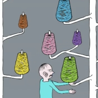
I’ve waited to post about the new record hoping we’d get a video to promote the release, and today, oh happy day, they delivered a visual just as complex and interesting as their music. Directed and animated by Matt Yarrington and Sara Winters, the video for the album’s title track “All Her Colours” (with fellow Caribou member John Schmersal on vocals) is the perfect animated trip. Any video with a heroine who mixes her own potion in a blanket fort in the park and ends up riding prisms through outer space is right up my alley. I already loved the video, but I loved it more after reading some of Yarrington’s background for the vid as told to MTV Hive“It is intended to portray color and light itself, personified as a female human and broken into a collection of archetypal aspects of the ‘oneself,’” he says. “Each color is like a vital center of the whole. The shadow character is the negative aspects of a ‘Macrocosmic Oversoul,’ who, in an effort to harness the power of light and wreak havoc, has trapped ‘White Light’ in a prism and refracted her into the individual colors of the visible spectrum.” 

So, basically, I love Yarrington as much as Weber now.

“All Her Colours” is out on Mint Records on April 2 and is up for digital/vinyl pre-order now.

stefan sagmeister: the happy show.

sagmeister_happy

Ask any good parent what their ultimate hope is for their child and the answer is usually the same: they want them to be happy. As adults, it’s the beginning of a new year, everyone is back at work and our resolutions – everything that seemed so possible mere weeks ago – are already being tested. While we strive to improve ourselves, in little and large ways, I think that if we distilled all of our resolutions into one succinct, combined, communal wish it would be “I want to be happier.” Don’t all personal roads we yearn to travel really lead to a place where we simply like ourselves more? And that’s why my visit last weekend to Stefan Sagmeister’s The Happy Show at Design Exchange came at exactly the right time.

Photo1-5

Sagmeister’s hand-written style lends itself perfectly to the energy of the entire exhibit. It’s more like a note passed in class than a formal letter. We’re not sitting down to study the official manual of happiness; we’re wandering, loosely, through the thoughts of someone that admittedly isn’t any more sure of the answers than we are. But he’s trying – and that’s what matters. From the hands protruding out of the wall offering Sagmeister’s favourite ginger candies (I took one) to the first 14 minutes of his eventual feature length documentary “The Happy Film” (I watched it twice), all of it gleaming in a beckoning coat of sunshine yellow, there was a feeling of wandering, like Alice, into an over-sized handwritten journal with past lessons come to life in a serene, contemplative Wonderland. 

joke 

The show is a balance between information and experience. The walls in the first section are covered in stats and figures revealing truths and examining how we, as a society, define the idea of happy and how we all strive to get there. The other aspect is interactive, offering mini-challenges that, in the case of the “Happiness Instructional Card Dispenser” where a card shot out of the wall telling me to text a joke to a number I’d never heard of, don’t really seem to have any goal greater than the fact that you allowed yourself to follow your curiosity and just do it. The “Gumball Personal Happiness Survey”, while delightfully retro, is more than just an easy attempt at interaction. The world’s psychologists do much of their research in the exact same way: they ask. Sagmeister writes “This seemed laughable to me until I learned that when freshly interviewed people were put into an MRI scanner, the data matched neatly. When their family & friends were also questioned, ditto, it all conformed.” (For the record, I took mine from #8.)

tumblr_mgkvjwFO4h1qzoequo1_500

And if we could find happiness, what would it look like exactly? As part of crowd-sourcing visual ideas of hand-drawn happy by collecting them at the exhibit and asking for them to be submitted to The Happy Show’s TumblrI just started drawing and didn’t think about it too much. Apparently happiness for me is being on a boat with a husband (sounds about right). That little nugget next to the sail is either a small child or a large dog – haven’t figured that part out yet. Clearly I’m much better at writing about art than drawing it, but my jellyfish (lower right) is pretty bad ass.

happy_draw

At the risk of sounding delusional, I felt like a bit of a kindred spirit with Sagmeister. Creative types probably have some of the same psychological hurdles and the things that obviously resonated enough for him to become part of the show struck me plainly. His explanation behind “Trying To Look Good Limits My Life”, while ironically also an exercise in really good-looking typography, felt like it could have been written by myself had I had the right moment of lucidity to get it out:

Photo1-3

stefan-sagmeister-680uw

But my favourite moment of the entire show was “Actually Doing the Things I Set Out to Do Increased My Overall Level of Satisfaction.” In the middle of the room sat a white bicycle on a metal riser, with instructions to ride it. My first thought was that it would be too embarrassing to hop onto a bicycle for an unknown reason in a room full of strangers. Then I asked a Docent if I was really allowed to ride the bicycle (so Canadian of me…) Then, brilliantly, across from the bicycle, I saw that Sagmeister had written: “Every single time I think ‘I should do this’ or ‘I should do that’ and then don’t follow through and actually do it, the uncompleted action creates a little nagging but otherwise empty space in my mind. I’ll also miss out on the satisfying feelings that comes with the completion of a project.”

He caught me! After that, there was no way I could live without getting on the damn bicycle. So I rode, and as I did the unlit matrix of neon tubing, in four simple phrases, taught what for me was the most significant insight of the day:

bike

If you don’t feel uncomfortable sometimes, you’re not doing anything worth doing. Lesson learned. It happened so simply and the sensation of realizing it so implicitly was a bit like getting up too quickly and seeing stars. I had one of those moments that you stop after and say to yourself “try to remember this.” It was fulfilling and invigorating and as I walked out of the exhibit onto the street I felt something palpable and tangible and easily defined. I was happy.

The Happy Show runs until March 3, 2013 at Design Exchange.

london grammar: hey now.

london grammar: hey now

2013 is only a few hours old and already it’s brought my favourite song of 2013. Funny how that works. I am riding tonight’s festivities into my bed and listening to one track, over and over, and it’s making my (new) year.

Out of nowhere comes “Hey Now”, the debut single from a enigmatic London-based trio London Grammar. I’m pretty good at the internet, but that’s all I can discover about them. Their YouTube has one video (a still of this one cover image over “Hey Now”), their Facebook says that they’re “recording”, and their Twitter basically says that… they’re recording. (Also, they tweeted at Sound of Arrows, so that’s a wonderfully good sign.) I’m complaining about none of this, because if they’re creating anything nearly as mystery-filled and infinitely listenable as “Hey Now” I am in desperate, desperate need of whatever it is. London Grammar… teach me music with words I don’t even know yet.

quasi-objects: lorenzo oggiano.

I’ve always loved the intersection of the digital and the organic, and how the hyper-depiction of seemingly natural subjects can be rendered so realistic that they border on seeming fake. Working in both video and 3D-generated visuals, Lorenzo Oggiano works inside a high-def macro world where his images play with polarity. Beginning his study in 2003 and still on-going, his “Quasi-Objects” series is obviously beautiful, but glistening grotesque; informed by the laws and evolutions of nature but not actually formed by them. Up-close, I can see flower stamens that resemble insect eggs and, with a blink of the eye, smooth skin that becomes scales and water drops mirror light like multi-faceted eyes. There’s a line where attraction and disgust run almost parallel, and he’s walking along it a spine-tingling way.

From Oggiano’s site: “Quasi-Objects” is an art project consisting of 3d generated videos and prints, a practice of “organic re-design” – started in 2003 and still in progress – that aims to stimulate thought and dialogue on the progressive relativisation of natural forms of life as a result of techno-biological evolution. “Quasi-Objects” regards data actualization, the production of biologically non-functional organisms and ecosystems as transient output of an operative practice: aesthetics of process.

Life is a real and autonomous process independent from any specific material manifestation.”

Via But Does It Float

feist + martin de thurah: the bad in each other.

I first fell in love with Danish director Martin de Thurah after his disturbingly glorious video for Fever Ray’s “When I Grow Up.” His gritty, realistic hand-held style is a perfect match for the dark undertones in Feist’s “The Bad In Each Other.” It’s a marriage made in video heaven.

nacho ormaechea / le carnet noir.

I’m a major fan of collage. Ever since I first discovered and fell in love with the work of Canadian artist Paul Butler years ago, I’ve been particularly fascinated by the way artists appropriate and juxtapose existing images (and our assumptions of their meanings) into brand new works. Lately I’ve noticed floods of new digital collage styles on Tumblr. As with anything, some are a bit more well done than others. All are art, but particular ones excel, and I’ve been especially excited by the work of Matt Wisniewski, Beth Hoeckel, and Dessi Terzieva.

Now I’m happy to add the gorgeous digital collages of Nacho Ormaechea’s Le Carnet Noir to the list.

A Spanish-born freelance Art Director and Graphic Designer working in Paris, Ormaechea’s work remove the urban dwellers from his obviously European backdrops and replaces them with colourful, incongruous images ranging from the organic – fruit and flowers – to the urban mundane – industrial hallways and electric signs. While his visual collisions might not have as much of a literal play on meaning or political subtext as others I’ve seen, they’re incredibly eye-catching in a straight forward, high def, casually bombastic way. And I can’t get enough of them. If you can’t either, then they’re all up for grabs over at Big Cartel.

matthew dear + morgan beringer: in the middle (i met you there).

The stable of amazing musicians on Ghostly International’s roster never fails to impress, and along with the audio they’ve also promoted their artists with consistently beautiful videos.

Their latest, directed by Morgan Beringer and promoting Matthew Dear’s Headcage EP, is a gorgeous, metallic, slithering, opalescent mess of wonderful goo.


The only thing that kinda bums me out is that it reminds me a bit too much of Robert Seidel’s legendary 2006 masterpiece for Zero 7’s Futures.

kris tate.

I like the collision of colour and greyscale, and also of forms that are literal with those that aren’t. Which is a fancy way of saying that I like it when deer wear bad 80s sweaters and lasers shoot out of cats’ eyes. Which is all an elaborate lead-up to the fact that I really dig these illustrations from British graphic designer Kris Tate. Even better, she’s got some gorgeous prints for sale online at Society 6, and if one of them could magically appear on my wall that would be mint.

fla + the freaks: the loner.

I’ve been waiting for this. A short while ago I posted about the trailer for this little gem. I couldn’t quite put my finger on it, but something about it resonated with me. I’m more than happy to report that the full-length video is just as exquisitely realized and heart-achingly simple as I’d hoped.

Directed and animated by FLA, I was blown away by the use of variety of perspectives and the amount of detail. I’ve watched again and again,  each time seeing new things and each time feeling a little more filled with a wonderful yearning.  At the end of the day, what a truly remarkable thing it would be to have someone (or some small pink monster-dog thing) fight to love you despite all your faults. To me, The Loner is about the power of realizing you need something when you want it the least and the possibility inside us all to turn around one day and decide to become, in small steps, a better version of yourself. I actually gasped at one point, which is how you know it’s damn good. When it was over I realized how much I didn’t want it to end, which I think it some of the highest praise I can give.

quick + dirty #2: red song, camouflar, we float and bad choices.

Quick + Dirty is back with a hot list of videos I think you need to see…

suuns: red song.

galaxie + mathieu cyr: camouflar.

my first earthquake + satan’s pearl horses: we float.

shout out out out out + a.j. bond + chris von szombathy: bad choices.